Somewhere in the back room of a medieval workshop, a painter is doing maths. Not creative maths, not the pleasing geometry of a composition. He is working out whether he can afford to paint the Virgin Mary's robe blue. Again.
This was a real problem, and it went on for centuries. The colour that we now squeeze from a cheap tube without a second thought was, for most of art history, genuinely scarce in a way that is almost impossible to imagine now. Not scarce like a limited edition. Scarce like a single mountain.
Where did medieval blue pigment come from?
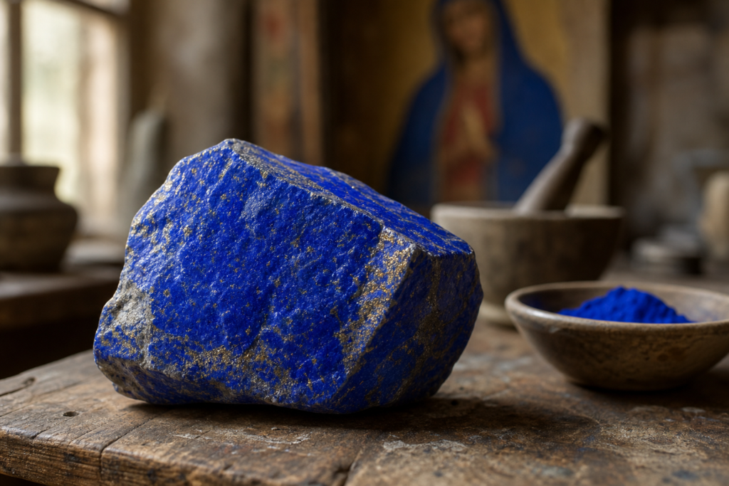
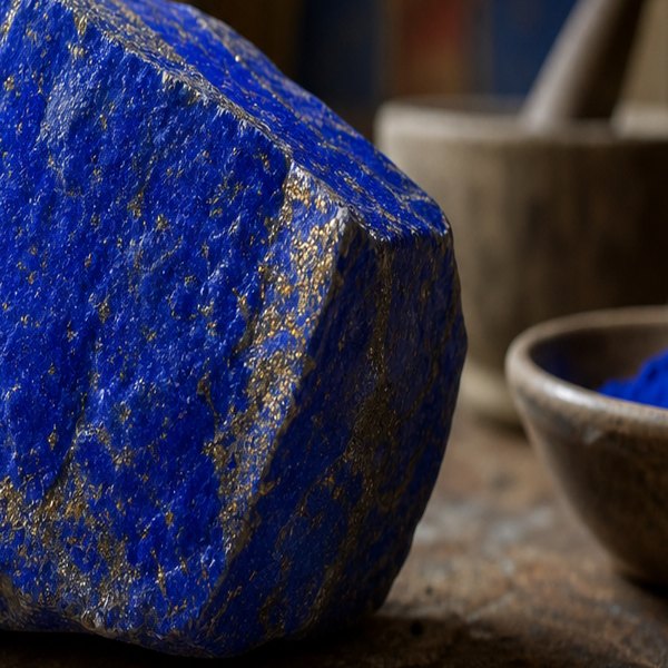
The mountain in question sits in the Kokcha Valley in what is now Afghanistan, and for roughly a thousand years it was the only reliable source of lapis lazuli on earth. Lapis lazuli is a metamorphic rock – deep, intensely blue, flecked with gold pyrite, and absolutely useless to a painter until you spend days grinding it down, washing it through lye solution, kneading it into a paste, and coaxing the pure pigment out from the grey waste. The result was ultramarine: the most vivid blue available to any European artist before the nineteenth century. It also cost, at various points in history, more per ounce than gold.
So Painters Rationed It
So painters did what any sensible person does with a material more expensive than gold: they rationed it obsessively. Contracts between Renaissance patrons and artists sometimes specified exactly how much ultramarine would appear in a given painting and who was paying for it. Lapis was listed alongside the artist's fee as a separate line item. Patrons who wanted the Virgin's robe painted in proper ultramarine had to supply it themselves, or pay a significant surcharge. Some painters, unwilling to part with their stock, used cheaper blue substitutes – azurite, smalt, even crushed glass tinted blue – and reserved the real thing for the holiest figures at the centre of the composition. This is why, if you look at enough medieval and Renaissance altarpieces, you start to notice a pattern: the background sky, where no one is really looking, tends toward a muddy grey-green. The Virgin's mantle, front and centre, is the one place the good stuff got spent.
What this means is that the physical cost of a pigment quietly wrote the grammar of a painting. The composition you read as spiritual – the holy figure radiant at the centre, the surroundings receding into neutrals – was partly a budget decision dressed up in theology.
Other Painters, Other Tricks
Other painters took different approaches. Some mixed ultramarine into the base layers, where it would be covered over but still influence the tone from underneath. Some diluted it so aggressively that the resulting colour was barely blue at all, more a pale, exhausted violet. A few, chasing lapis on credit and unable to pay their pigment merchant, went spectacularly broke. The colour left its fingerprints on careers, not just canvases.
When did blue become cheap?
Then, in 1828, a French industrial chemist named Jean-Baptiste Guimet won a prize offered by the Société d'Encouragement pour l'Industrie Nationale for successfully synthesising ultramarine in a factory. The colour, which had required ancient mines, months of caravan routes across Central Asia, and a small fortune per ounce, could now be produced by heating clay, sulphur and sodium carbonate in a kiln. Synthetic ultramarine cost, almost immediately, next to nothing.
The sky became affordable. And quietly, without anyone announcing it as a revolution, the whole visual logic of Western painting shifted. No longer was there any reason to hoard blue in the centre and starve it from the edges – painters could bathe entire canvases in it. The Impressionists, working just a few decades after Guimet's factory opened, painted shadows in blue, light in blue, water in forty different blues, because they finally could. Monet's skies are not a spiritual statement. They are partly a supply chain story.
It's a strange thing to hold in your head when you stand in front of a painting – that the choices you read as artistic vision were sometimes just the pragmatic calculations of someone trying to make a beautiful thing under material constraints. The poverty didn't diminish the art. If anything, it explains some of the loveliest decisions in it.
Questions this raises
- Why was ultramarine more expensive than gold?
- How did painters afford blue?